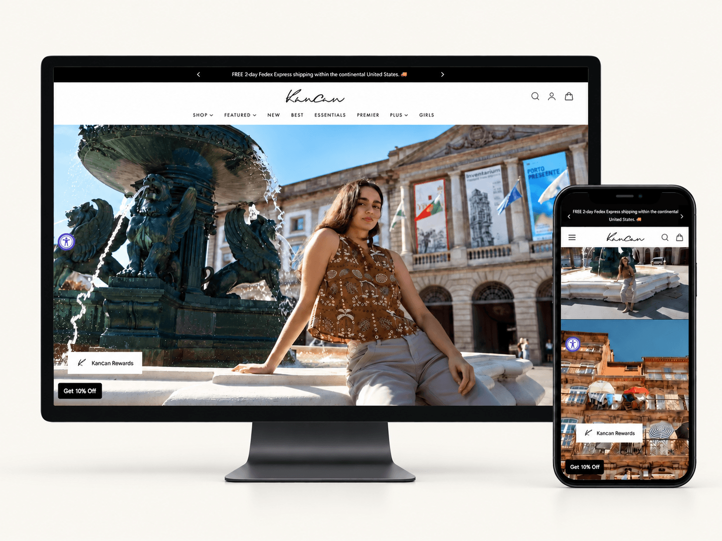
Kancan · Ecommerce redesign
Making denim easier to discover and shop
An audit-led Shopify redesign focused on clearer navigation, product discovery, and the next step toward purchase.
- Industry
- Fashion & apparel
- Employer
- Kancan USA
- Role
- Lead UX designer / data analysis
- Team
- HOWARD KIM
The problem: finding a path to purchase
Kancan USA sells women’s denim and apparel directly to consumers. Its desktop and mobile shopping experience made it difficult to find products and complete a purchase: navigation was unclear, the visual hierarchy was weak, and calls to action were inconsistent.
As the solo lead UX designer, I audited the shopping journey, reviewed customer behavior and feedback, and implemented the redesign directly in Shopify.
Clearer navigation
Help shoppers understand where to start and how to move through the catalog.
Easier discovery
Give collections and products a clearer place in the page hierarchy.
Consistent next steps
Make calls to action easier to recognize throughout the shopping journey.
Understanding the shopping experience
I combined a review of navigation, layout, and user flow with Hotjar heatmaps, click patterns, scroll behavior, and surveys. The goal was to identify where shoppers encountered friction and use that evidence to prioritize the redesign.
01 — Audit the path from browsing to buying
I reviewed the existing site for usability issues and inconsistencies. The annotated homepage and product-page reviews connected individual interface problems to the larger shopping journey, helping me prioritize navigation, hierarchy, and calls to action.
My starting question
At each stage, could a shopper tell where they were, what mattered, and what to do next? I used that question to connect the audit findings to the path to purchase. A navigation issue could prevent discovery; an unclear product page could interrupt the decision to buy.


02 — Connect the audit to customer behavior
Hotjar helped me examine which areas received attention and which were overlooked. Surveys added direct feedback about navigation, product discovery, and calls to action. Together, these inputs informed the redesign priorities.
How I weighed the evidence
I treated the audit as a starting point and used behavior and feedback to add context. Heatmaps showed where people interacted, while surveys helped explain their frustrations. Reading those sources together helped me prioritize the parts of the journey that needed clearer guidance.

Designing a clearer shopping journey
03 — Turn the findings into Shopify improvements
I translated the audit into changes to navigation, layout, visual hierarchy, and purchase controls directly in Shopify. The story follows three decisions a shopper makes: where to browse, which product to choose, and what to do next.
Current desktop and mobile screens, captured October 2026, illustrate the shopping flow. The project’s Q3–Q4 2025 results follow below.
The shopping journey in motion
See how the experience adapts from desktop to mobile, from discovering the collection to exploring a product. The detailed design decisions follow below.
01 / Discover a relevant product
Give browsing a clear direction
The audit highlighted unclear navigation and weak hierarchy around product discovery. My priority was to help shoppers move from campaign imagery into the catalog with a clearer sense of where to go.
The current collection page makes that path visible: a named collection, filters for fit and size, and a consistent product grid. On mobile, the same choices sit above a two-column layout.
Why I focused on browsing direction
Campaign imagery introduces the brand, but shoppers also need a clear route into relevant products. My design priority was to connect that visual experience to navigation and collection entry points. On a smaller screen, a clear order of information becomes especially important.


Once a shopper finds a promising style, the next question is whether it is right for them.
02 / Make the product decision
Bring the details closer to the action
The product-page audit called attention to the long image layout and the clarity of purchase controls. I focused on organizing the page around product evaluation and a recognizable next step.
The current desktop page groups imagery with price, availability, color, size, and the add-to-cart action. The mobile views show the sequence from a thumbnail gallery to size selection and purchase controls, with size-chart access beside the choices.
How I thought about the product decision
I considered what a shopper needed to understand before adding an item: its appearance, price, available options, and size. My focus was on the relationship between that information and the purchase action. The current screens illustrate how those pieces can support one decision without asking shoppers to piece the page together.


From looking to choosing
The earlier audit questioned how much scrolling the product imagery required. This current mobile view shows a compact gallery before the product details, followed by the selection controls above.
Select any screenshot to inspect it at full size.
After the product and size are chosen, the cart needs to make the selection easy to check.
03 / Review before checkout
Keep the next step in view
The redesign treated calls to action as part of a connected journey. The current cart continues that story by bringing the selected product, size, quantity, and estimated total into one review area.
On desktop, the drawer preserves the product-page context. On mobile, it fills the screen so shoppers can review their selection and find the checkout action.
Why review comes before checkout
I saw the cart as a checkpoint in the journey. Before continuing, a shopper needs to confirm the item, size, quantity, and total. The current cart screens illustrate the principle I carried through the redesign: keep the information needed for a decision close to the next action.


One connected path, from discovery to checkout
Navigation, product information, and calls to action were considered together. The aim was to make each decision easier to understand and carry shoppers naturally into the next stage. I then reviewed performance across the same shopping funnel.
Explore the live Kancan storeResults across the shopping funnel
Conversion, add-to-cart, and checkout reach all increased between Q3 and Q4 2025.
Conversion rate
+0.21 percentage points
Q3 → Q4 2025
Add-to-cart rate
+1.70 percentage points
Q3 → Q4 2025
Reached checkout
+2.11 percentage points
Q3 → Q4 2025
Quarter-to-quarter results show the observed change; they do not isolate the redesign from other factors.
How I read the results
I looked across add-to-cart, checkout reach, and conversion because each reflects a different step in the shopping journey. The increases were encouraging, but I would not attribute the entire change to design alone. They gave me a reason to keep investigating where shoppers progressed and where friction remained.
Reflection
This project connected UX evaluation to implementation. The audit identified friction, behavioral data and survey feedback informed priorities, and direct Shopify implementation made it possible to iterate on navigation, discovery, and calls to action as one connected experience.